Unveil the secrets to choosing colors that inspire community.
Color plays a big part in transforming a blank canvas into a vibrant community. It has the ability to evoke emotions, influence moods, and create beautiful and functional spaces.
Join us as we dive into the world of color and discover how it can elevate your housing community. In this overview, we’ll explore:
Understanding the Impact of Color
Colors have a profound impact on our emotions and psychological well-being, and this holds true in the context of interior spaces. For example, warm colors like reds, oranges, and yellows tend to evoke feelings of energy, passion, and positivity. Cool colors like blues and greens are known for calming and soothing effects.
Numerous studies on color theory support these concepts, guiding interior designers to achieve an atmosphere that aligns with intention. Whether you want to encourage socialization or creativity, productivity or calmness, color serves as one of the defining design factors that enables these experiences.
Identifying Your Design Goals
Because color contributes to the function and beauty of a space, it’s essential to start with a specific goal in mind. This might be creating a vibrant lobby, a cozy study area in student housing, or a modern multipurpose room in multifamily housing.
Design goals spill into individual units, too. For instance, bedrooms are places where tranquility and relaxation are welcome, perfect for cool hues. By contrast, kitchen and dining areas may benefit from stimulating colors like reds and yellows.
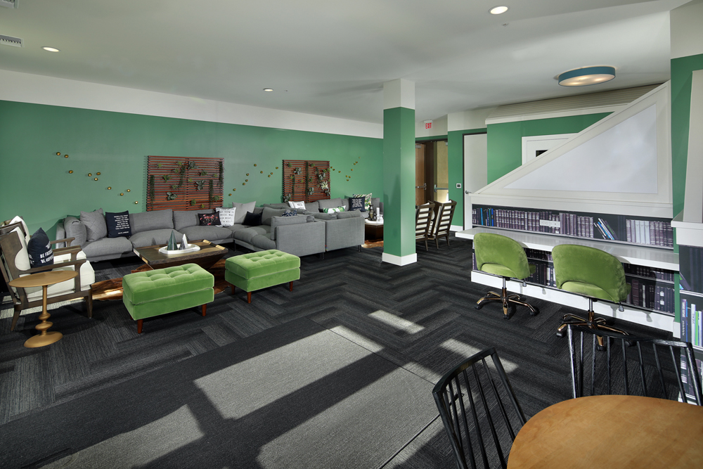
Consider the study areas in the Ryder on Olive as an example. The soothing combination of green and white tones not only creates a tranquil ambiance but also cleverly accentuates various functional spaces within the space:

Exploring Color Harmonies
Some pairs are naturally linked or compliment each other effortlessly. The same applies to color, something we call color harmonies.
Color harmonies are the secret ingredient to visually stunning designs. These combinations of colors work perfectly together and create a sense of balance. Popular examples include:
- Complementary: Colors that are opposite of each other on the color wheel, providing a contrast between warm and cool tones to add depth and dimension.
- Analogous: Colors that are next to each other on the color wheel, creating a sense of unity and cohesiveness that’s calming to the eye.
- Triadic: A selection of three colors that are equidistant from each other on the color wheel, creating balance while allowing for a wide range of combinations and possibilities.
Understanding color harmonies allows you to take your color selection to the next level by helping you apply coordinating colors to your design goals.
Considering Practical Factors
Elements like lighting, room size, and furnishings can also impact your color choices. Color has the power to make a room feel bigger or cozier, depending on your goals.
In larger rooms, bold and vibrant colors create a sense of energy and excitement. Consider using deep blues or rich reds as accent colors against a neutral backdrop. This will help define different areas within the room and create visual interest.
In smaller spaces, lighter and softer hues visually expand the area. Creams and pastels work well since they reflect light and give the illusion of more space. Incorporating mirrors is another way to enhance this effect.
Color can also appear differently under various lighting conditions (e.g., natural light vs. fluorescent). For instance, light colors maximize a room’s natural lighting and make it appear brighter. If natural lighting is limited or non-existent, bright colors can appear dull or washed out. Warm colors, jewel tones, and neutrals can counter these effects.
Also, consider any furnishings that will be in the room. These have the potential to create shadows, block natural light flow, or otherwise alter how colors appear in a space.
Testing and Finalizing Your Color Scheme
One of the best ways to know how colors will look in your space is to test them. This lets you see how your interior will appear before investing time and money into painting and decorating.
One of the easiest ways to do this is to create a digital mockup or rendering of your space. This mockup shows colors as well as windows, furniture placements, and floor plans. However, there’s no easy way to account for lighting with this strategy.
Another option is to paint test patches in the space and see how they interact with other colors present. This way, you can observe how different lighting conditions throughout the day influence your color choices.
Implementing Your Chosen Color Scheme
Implementing your color scheme requires more than painting walls. You’ll need to coordinate colors for accent walls, trim work, and doors. Things like furniture, window treatments, rugs, and lamps need to be purposefully selected to align with your new design.
Professional resources like SouthPark Interiors can assist with color implementation and leave no detail untouched.
Applying the Perfect Color Scheme to Your Next Housing Development
Understanding color theory helps you bring your housing design to life, adding form and function to every space. For help in crafting the perfect color scheme, reach out to SouthPark Interiors for professional guidance.
